When a brand with a storied history like Jaguar changes its logo, it is never a mere aesthetic update. Such a move is often emblematic of deeper shifts in strategy, signalling a repositioning. The latest change in Jaguar’s logo overtly suggests the repositioning of the brand for a strategic shift in identity and future direction. While the automotive industry increasingly moves toward electrification, sustainability, and digital innovation, legacy brands like Jaguar need to upgrade themselves to meet new challenges.
This evolution immediately comes into play with the modern, simplified representation of the iconic leaping jaguar emblem in the new form. It’s way more than just a refreshment in design but somewhat representative of the future of Jaguar in visual form as it redefines itself amidst a changed automotive landscape.
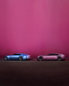
All the renovations are driven by the ambition of Jaguar to turn into an all-electric premium brand by 2025. This includes not only wide modifications towards electrification but also attempts at re-imagining the brand identity in anticipation of a new generation of truly ecologically conscious and advanced technology-savvy motorists. A cleaner, tidier logo speaks to such a vision through minimalism, effectiveness, and forward-thinking-chief qualities at the heart of any electric vehicle design.
Historically, the name Jaguar has been associated with luxury, great performance, and Britishness. While important, these remain at its core, and the new identity indeed leans more toward the modernity within the luxury spectrum-simply put, tradition merged into hi-tech. But it is only a very detailed design that can characterize the last logo, even though it is iconic and can represent only a past era of design of the automobile world an immediate focus was on mechanical excellence, more so than anything else. This refreshed new look, as simplified in its form for new-age digital platforms, most importantly enabled today’s marketing and customer engagement efforts in toto.
This further simplification of the design conveys more about agility and precision, which is quintessential in electric cars that boast of instant torque and seamless acceleration. The more abstract, fluid leaping jaguar finally conveys movement, speed, and progress, which again is in tune with the brand’s push toward innovation.

The new Jaguar logo embraces minimalism. This shift is especially relevant as the brand aims to attract a younger, tech-savvy audience who value contemporary aesthetics and sustainable innovation. The simplicity of the new logo mirrors the design ethos of electric vehicles themselves: sleek, efficient, and forward-thinking.
This repositioning also covers the overall brand experience: Jaguar wants to offer not just luxury cars, but a premium customer experience defined by personal services, digital connectivity, and sustainability.
Jaguar’s repositioning is also a competitive necessity. As rivals like Tesla, Porsche, and Mercedes-Benz push aggressively into the electric and premium automotive segments, Jaguar must differentiate itself.

The makeover also helps keep Jaguar ahead in the premium EV category. Such a hypercompetitive segment, where takers such as Tesla, Porsche, and other similar firms from the premium segment take on each other, helps the refreshed lines of Jaguar easily stand out while retaining much of its heritage appeal.
It reflects the wider impetus for corporate branding today: ease and flexibility for digital communications. Logos must work across websites and apps, car badges, and merchandising. The latest Jaguar marque achieves just that, having clarity and visibility across a host of touchpoints.
The change in the Jaguar logo, though, is anything but cosmetic. It signifies the transformation into a new era of sustainability, innovation, and modern luxury.

